

Galería Editorial Scroll
Personalizado en HTML y CSS

Narrativa visual en cada imagen
Scroll horizontal fluido
Galería responsiva

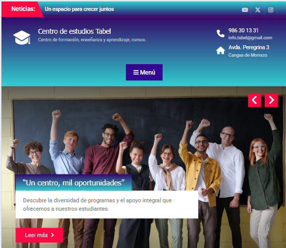
I developed this web platform using WordPress and the Wen Themes theme, configuring it to clearly present services, courses, and contact channels. I designed the site’s architecture and structure prioritizing intuitive navigation, organizing sections so users can quickly identify key information and move through the content seamlessly. Regarding the visual design, I maintained a clean and light aesthetic, adapting every component to different devices to ensure a completely fluid and responsive experience across both desktop and mobile
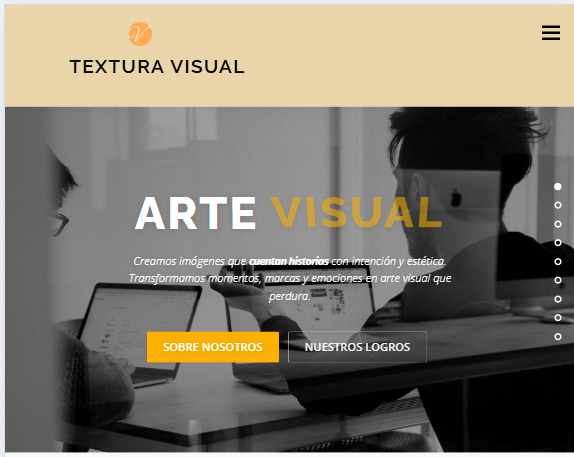
I designed and developed this web platform using WordPress and Elementor. It features a one-page layout where all content is organized into a continuous visual journey. I structured the site prioritizing a spacious and clean presentation, making photography and imagery the central axis to convey the studio’s style and approach.
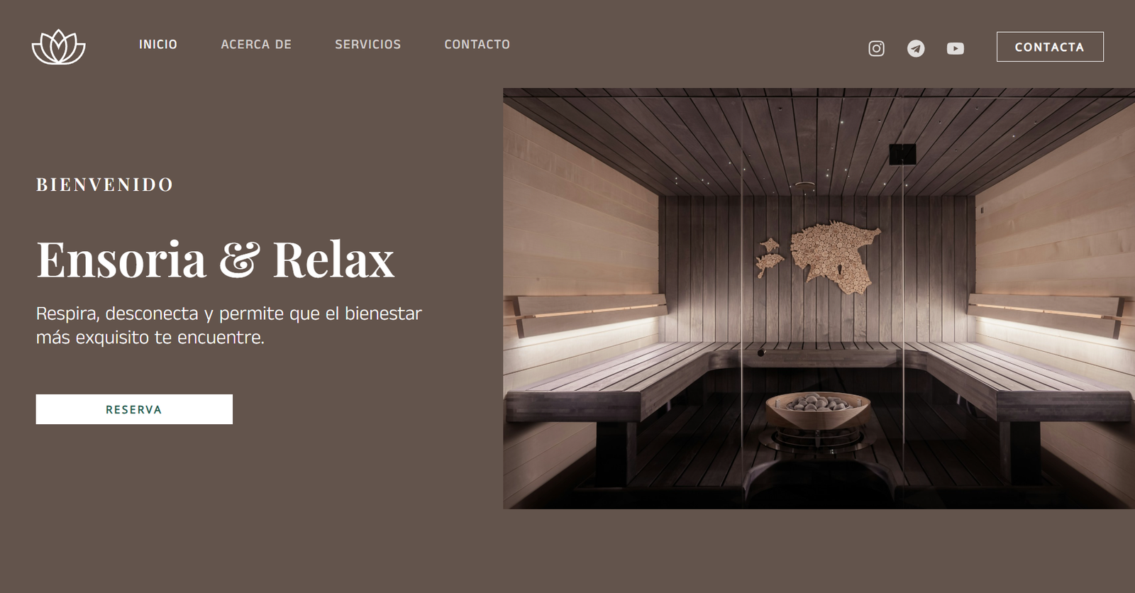
I developed this corporate web platform using WordPress and the Astra theme, configuring it with an absolute focus on user experience (UX). I designed an architecture that organizes services, pricing, and booking options into a simple and intuitive visual journey. For the user interface (UI), I prioritized the use of spacious blocks, high-readability typography, and a balanced use of white space. The main goal of these design decisions was to convey a sense of calm, balance, and professionalism that perfectly aligns with the spa center’s identity.
I designed an automatic editorial slider using pure HTML and CSS, completely eliminating the need for JavaScript. The core of the component is an infinite loop animation (@keyframes fade) mathematically coordinated using animation-delay in 4-second intervals for each slide. I structured an immersive design with full-scale images using object-fit: cover, text overlay with depth shadows to guarantee readability, and interactive calls to action (.btn-sandra). The component includes responsive media queries to ensure typography, buttons, and containers scale proportionally on mobile devices.
I developed an interactive editorial gallery based on native horizontal scrolling using pure HTML and CSS. The core layout relies on a flex container locked into a single continuous row using flex-wrap: nowrap. I implemented advanced properties like scroll-snap-type: x mandatory and scroll-snap-align: start to guarantee that each item snaps perfectly into place during navigation. Additionally, I customized the scrollbar using webkit pseudo-elements and applied media queries to smoothly scale down the fixed image dimensions on mobile screens.
Galería Editorial Scroll
Personalizado en HTML y CSS
Narrativa visual en cada imagen
Scroll horizontal fluido
Galería responsiva


La imagen combina realismo mágico, aventura y un tratamiento visual detallado que refuerza la idea de exploración y conexión con la naturaleza. La paleta cromática se basa en azules intensos, tonos cálidos de madera y acentos vibrantes en los carteles direccionales, creando una atmósfera luminosa y evocadora.
Software
Adobe Photoshop: utilizado para la creación del fotomontaje, la integración de elementos marinos y para expandir texturas, ajustar iluminación y armonizar la escena además del diseño y refinamiento de la tipografía.
Aplicación de IA generativa.
La pieza se construyó mediante fotomontaje digital y técnicas de IA generativa aplicadas en Photoshop para crear un entorno cohesionado a partir de múltiples fuentes visuales. Se ajustaron profundidad, color y perspectiva para lograr una composición equilibrada y envolvente.
La pieza presenta una estética surrealista y poética, construida a partir de una figura femenina en estado introspectivo, cuya cabellera se transforma en un estallido de mariposas multicolores. La imagen combina simbolismo, fantasía y un tratamiento visual detallado que refuerza la idea de metamorfosis interior. La paleta cromática se basa en verdes profundos, acentos luminosos y contrastes vibrantes que potencian la atmósfera onírica.
Software:
Adobe Photoshop: con herramientas de IA generativa para la creación y expansión de elementos orgánicos (mariposas, texturas y volúmenes).
Adobe Illustrator: para la integración tipográfica y el diseño de identidad visual asociado al concepto editorial.
Generación y composición:
Imagen generada mediante prompts y variaciones de IA generativa, posteriormente refinada con técnicas de retoque digital en Photoshop. Se ajustaron iluminación, contraste y profundidad para lograr una composición equilibrada y envolvente. La figura central se integra con un conjunto de mariposas generadas y modificadas mediante IA, creando un flujo visual ascendente que simboliza transformación y liberación.

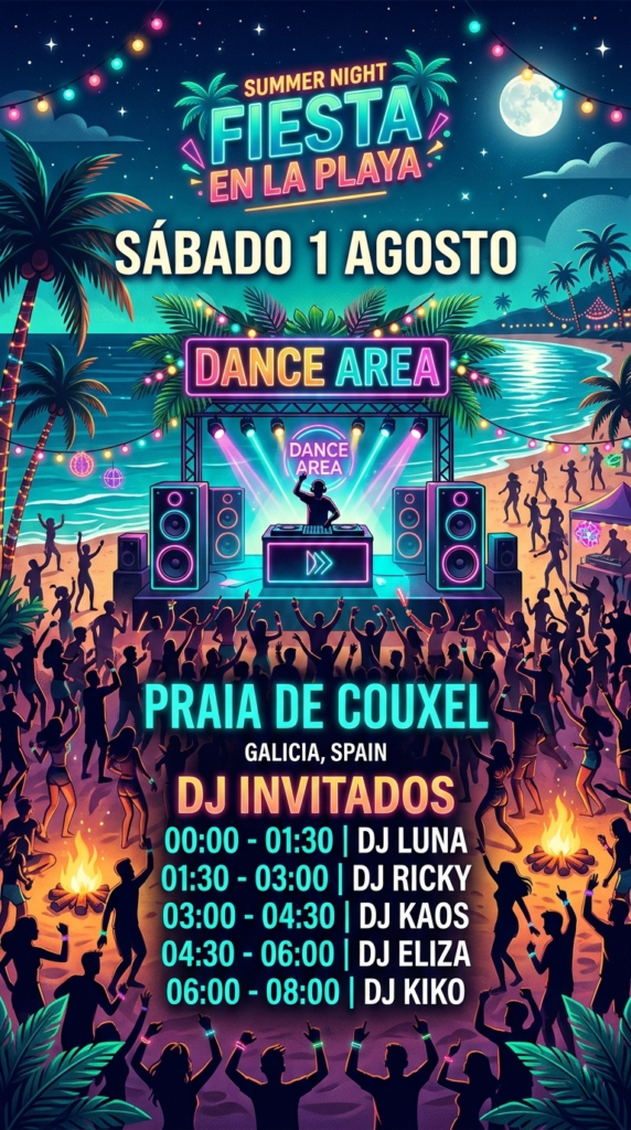
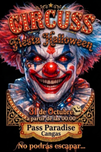

Publicidad digital: Cartel promocional del evento Salón del Cómic
La composición presenta una estética vibrante y narrativa, con predominio de tonos saturados y contrastes marcados que evocan el universo gráfico del cómic. El cartel combina elementos visuales propios de la cultura pop, la ilustración secuencial y el lenguaje visual de la historieta.
Producción técnica:
Software:
Adobe Photoshop con herramientas de IA generativa para la creación de personajes, viñetas y ambientación urbana.
Generación y composición:
Imagen generada mediante prompts y ajustes de IA, posteriormente refinada con técnicas de retoque digital. Se integran figuras inspiradas en superhéroes, ciencia ficción y fantasía, en una escena dinámica con efectos de luz intensa, contornos definidos y paleta cromática basada en rojos, azules, negros y tonos neón. La composición busca simular una portada de cómic, con tipografía impactante y estructura visual en capas.
Publicidad digital: Travesía a remo en fusión ilustración–fotografía
Cartel promocional creado para una travesía a remo, construido a partir de una imagen híbrida que combina fotografía real y elementos ilustrados. La escena muestra una playa luminosa como punto de partida y varias personas remando en primer plano, integradas mediante técnicas de dibujo digital y retoque fotográfico.
Producción técnica:
Software:
Adobe Photoshop con IA generativa para la creación y ampliación de elementos visuales; Adobe InDesign para la maquetación final del cartel; Photoshop para el retoque, integración y acabado general.
Generación y composición:
La base del cartel parte de una fotografía de playa, sobre la que se integran figuras remando generadas y refinadas con IA generativa de Photoshop. Se combinan capas fotográficas con trazos ilustrados, contornos suavizados y texturas añadidas manualmente para lograr una estética mixta entre realismo y dibujo digital. La composición se equilibra mediante ajustes de luz, color y perspectiva para reforzar la sensación de profundidad y dirección del movimiento.
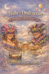
Publicidad digital: Cartel de baile de disfraces
La composición presenta una estética luminosa y festiva, con predominio de tonos claros y suaves que transmiten ligereza y ambiente celebratorio. El cartel combina elementos visuales propios de una fiesta temática de cuento.
Producción técnica:
Software
Adobe Photoshop con herramientas de IA generativa para la creación de personajes, ambientación y elementos decorativos.
Generación y composición:
Imagen generada mediante prompts y ajustes de IA, posteriormente refinada con técnicas de retoque digital. Se integran figuras disfrazadas en una escena clara y luminosa, con efectos de luz suave, brillos difusos y armonía cromática basada en blancos, beige, pastel y tonos cálidos.
Imagen digital superrealista creada mediante IA generativa de Photoshop, donde se combina estética futurista con elementos simbólicos. El conjunto funciona como un cartel conceptual para una convocatoria de arte digital, integrando tipografía y efectos visuales que potencian su carácter promocional.
Software:
Adobe Photoshop con herramientas de IA generativa (Generative Fill / Generative Expand) para la creación, ampliación y refinamiento de la escena.
InDesign: Textos.
Generación y composición:
Montaje híbrido que combina elementos generados por IA con retoques manuales. La figura femenina y el vehículo se integran en un entorno futurista mediante ajustes de iluminación, sombras coherentes y corrección de color avanzada.
La infografía se construye a partir de una estructura clara y ordenada, donde cada bloque temático encuentra su espacio dentro de una retícula pensada para que la información respire y se lea con naturalidad. Los iconos y la ilustración central aportan cercanía y ayudan a guiar la mirada, manteniendo un estilo sencillo y amable que hace que el contenido resulte accesible. El conjunto busca transmitir calma y claridad, reflejando la idea de “limpiar” y organizar la vida digital de forma visualmente coherente.
Técnicas empleadas:
Adobe InDesign — organización de la retícula, distribución de los cinco apartados, jerarquía tipográfica y composición final de la pieza.
Adobe Photoshop — creación y ajuste de iconos e ilustraciones, armonización de la paleta de color y preparación de los elementos gráficos para su integración en la maquetación.
Motion graphics — animación de los bloques informativos, movimiento suave de iconos y textos y construcción de una versión audiovisual que mantiene el tono y la estética de la infografía original.
Banner publicitario digital: integración de fotografía e ilustración vectorial
La fotografía ha sido tratada para potenciar la atmósfera de calma mediante ajustes de color, filtros de iluminación y correcciones de contraste, logrando una estética limpia y equilibrada.
Sobre la imagen se superpone una ilustración vectorial minimalista de una figura en postura de yoga, creada con líneas finas y curvas fluidas que aportan un estilo elegante y contemporáneo. Este elemento vectorial se integra sin perder nitidez, manteniendo la estética propia del diseño escalable.
Técnicas empleadas
La figura central parte de un círculo trabajado con volumen y efecto tridimensional, construido mediante herramientas vectoriales que permiten definir luces, sombras y profundidad sin perder la limpieza del trazo. Sobre esta base geométrica se integran ojos y manos estilizadas, añadiendo rasgos antropomórficos que aportan expresividad y carácter a la composición. El conjunto mantiene una estética clara y sintética, pensada para funcionar como elemento gráfico versátil en distintos contextos visuales.
Técnicas empleadas:
Prototipo creado para su inclusión en folletos y recursos educativos de primaria, con un enfoque visual pensado para facilitar la comprensión y reforzar el mensaje pedagógico. La ilustración está diseñada íntegramente en CorelDRAW, utilizando un lenguaje gráfico sencillo pero expresivo, adecuado para público infantil.
La escena representa una situación cotidiana cargada de simbolismo visual, donde cada elemento está construido mediante trazados vectoriales precisos, contornos limpios y una paleta cromática equilibrada. Se aplican transparencias, superposiciones y variaciones de grosor para aportar profundidad y dinamismo sin perder la estética característica del estilo de viñeta.
El resultado es una pieza clara, adaptable y fácilmente escalable, preparada para su uso en soportes impresos y digitales, manteniendo siempre la nitidez y coherencia visual propias del diseño vectorial.
Pieza gráfica creada para transmitir la relación entre el movimiento del cuerpo y la estética del arte visual. El diseño combina fotografía y composición digital para resaltar dinamismo, fluidez y expresividad.
Producción técnica:
Enfoque visual:
Uso de tonos y formas que acompañan la gestualidad del cuerpo, creando un cartel equilibrado entre lo artístico y lo publicitario, pensado para impresión de alta calidad.
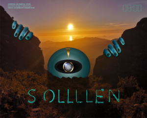
Publicidad digital: Fusión de tecnología y naturaleza
Imagen conceptual que representa la integración entre lo natural y lo artificial. Se compone de un paisaje montañoso al atardecer intervenido con elementos futuristas: un ojo robótico central y manos segmentadas emergiendo del terreno, que evocan una presencia extraterrestre.
Producción técnica:
Aplicación: Pieza pensada para campañas digitales o eventos temáticos, con fuerte carga conceptual y estética sci-fi.